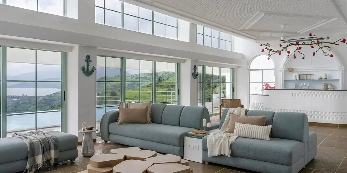

Luxury in a villa apartment is not defined only by expensive materials, large rooms, or statement furniture. Colour plays an equally important role in creating a sophisticated, cohesive, and timeless interior. The right colour palette can make a villa apartment feel more spacious, layered, welcoming, and visually refined.
For homeowners exploring villa apartment color palettes, the goal is not simply to select beautiful colours. It is to create a carefully balanced combination of wall colours, furniture tones, flooring, fabrics, lighting, and decorative accents that reflects the architecture and lifestyle of the home.
From warm neutrals and earthy tones to dramatic jewel shades and contemporary monochromes, luxury villa apartments can work with a wide range of palettes. The key is knowing how to combine them without making the interiors feel overwhelming.
What Are Villa Apartment Colour Palettes?
Villa apartment colour palettes are coordinated combinations of colours used across walls, ceilings, furniture, flooring, fabrics, lighting, and décor to create a cohesive luxury interior.
Unlike choosing individual colours for separate rooms, a whole-home palette establishes visual continuity throughout the villa apartment. This approach is particularly effective in large open-plan homes where living rooms, dining areas, kitchens, corridors, and family spaces often connect visually.
One or two complementary secondary colours
Accent colours
Natural material tones
Metallic or decorative highlights
Colours influenced by natural and artificial lighting
The result is an interior that feels intentional rather than simply decorated.
Why Colour Matters in Villa Apartment Interior Design
Colour influences how we perceive the size, mood, warmth, and character of a space. In a luxury villa interior design apartment, it can also help define different zones while maintaining a consistent design language.
1Colour Creates a Sense of Luxury
Sophisticated interiors often rely on restrained combinations rather than excessive colour. Warm ivory, taupe, stone, beige, walnut, charcoal, and muted metallics can create a luxurious atmosphere without appearing overly decorative.
2Colour Connects Different Spaces
An open-plan villa apartment benefits from a consistent colour story. A neutral living room can transition into a dining area with deeper accents while maintaining visual harmony.
3Colour Enhances Architectural Features
High ceilings, large windows, curved walls, feature panels, niches, and statement staircases can become more prominent when supported by the right colour palette.
4Colour Influences Mood
Soft neutrals can create calmness, earthy colours can introduce warmth, while darker shades can create drama and intimacy.
5Colour Works With Natural Light
The same paint colour can look dramatically different in morning, afternoon, and evening light. Understanding how sunlight enters a villa apartment is therefore essential when selecting colours.
FAQs: Why Colour Matters in Villa Apartment Interior Design
1. Why is colour important in villa apartment interior design?
Colour influences the mood, visual proportions, and overall character of a villa apartment. A well-planned palette can make spaces feel more spacious, cohesive, sophisticated, and inviting.
2. How can colour make a villa apartment look more luxurious?
Using a balanced combination of refined neutrals, natural tones, rich accents, and complementary materials can create a sophisticated appearance. Colours such as warm beige, ivory, taupe, deep green, charcoal, and muted metallics can enhance a luxury aesthetic.
3. How does natural light affect colour choices in a villa apartment?
Natural light can change how colours appear throughout the day. Warm colours may become richer in sunlight, while cooler shades can appear more neutral or subdued. Testing colours under the room’s actual lighting conditions helps achieve the intended look.
8 Luxury Colour Palettes for Villa Apartments
There is no single definition of luxury colour. The most successful palettes are usually those that complement the architecture, materials, lighting, and personality of the homeowner.
1Warm Neutral and Beige Palette
Warm neutrals are among the most versatile choices for luxury villa apartments.
Think of:
- Ivory
- Cream
- Sand
- Beige
- Taupe
- Greige
- Warm white
- Light walnut
This palette creates a relaxed yet sophisticated environment and works particularly well with natural stone, wood, linen, brass, and soft upholstery.
Best for: Living rooms, bedrooms, dining areas, and large open-plan spaces.
Design Tip
Instead of using one beige throughout the home, combine several tonal variations. For example, pair warm ivory walls with taupe upholstery, walnut furniture, beige stone, and darker brown accents.
This creates depth without relying on strong colours.
2Earthy Green and Natural Wood Palette
Green can bring a connection to nature into a villa apartment, particularly when paired with timber and natural materials.
A sophisticated earthy-green palette can include:
- Sage green
- Olive
- Moss
- Warm beige
- Walnut brown
- Terracotta accents
This combination is especially effective in homes with balconies, terraces, indoor plants, or large windows overlooking greenery.
Best for: Living rooms, reading areas, bedrooms, and private lounges.
Why It Works
Earthy greens are visually calming while wood introduces warmth. Together, they create a refined biophilic-inspired interior without making the space feel overly themed.
3Charcoal, Cream and Metallic Palette
For homeowners looking for a more dramatic luxury aesthetic, charcoal and cream create a striking contrast.
A typical palette may include:
- Soft cream
- Charcoal grey
- Deep graphite
- Walnut
- Brushed brass
- Antique gold
The darker shades can be introduced through feature walls, furniture, cabinetry, rugs, or decorative elements.
Best for: Formal living rooms, entertainment rooms, dining areas, and sophisticated master bedrooms.
Design Tip
Use dark colours strategically rather than covering every surface. A charcoal feature wall or dark cabinetry can provide visual drama while lighter surrounding surfaces maintain balance.
4Greige and Stone Palette
Greige, the combination of grey and beige, is particularly useful for contemporary villa interiors because it sits between cool and warm colour families.
Combine:
- Greige
- Travertine or stone tones
- Off-white
- Soft grey
- Light oak
- Brushed metal
This creates an understated luxury aesthetic that can work across contemporary and transitional interiors.
Best for: Minimalist villa apartments and modern open-plan homes.
5Deep Blue and Warm Neutral Palette
Deep blue can introduce richness without the visual heaviness of black.
Consider combining:
- Navy
- Midnight blue
- Cream
- Camel
- Walnut
- Brass
Deep blue works particularly well as an accent colour in upholstery, cabinetry, artwork, rugs, or feature walls.
Best for: Libraries, lounges, bedrooms, home offices, and entertainment spaces.
A Luxury Approach
Rather than using bright blue, choose muted or deep shades. Pairing them with warm neutrals and natural wood keeps the interior sophisticated.
6Terracotta, Sand and Brown Palette
For a warmer, more organic luxury look, terracotta can be combined with sand, beige, clay, and brown.
A balanced palette may include:
- Sand
- Terracotta
- Clay
- Warm white
- Chocolate brown
- Natural wood
This palette works particularly well with textured walls, handcrafted décor, natural fabrics, and stone.
Best for: Dining rooms, living spaces, balconies, and relaxed family areas.
7Monochromatic Grey Palette
A monochromatic palette can create a highly contemporary villa apartment when different shades and textures are layered carefully.
Use:
- Pale grey
- Medium grey
- Graphite
- Charcoal
- Silver
- Black accents
The key to preventing a monochromatic interior from appearing flat is texture.
Combine grey with:
- Marble
- Textured upholstery
- Timber
- Fluted panels
- Glass
- Metal
- Sculptural lighting
The result can feel architectural, sophisticated, and distinctly modern.
8Jewel-Tone Accent Palette
Jewel tones can bring personality and drama to a luxury villa apartment.
Popular options include:
- Emerald green
- Sapphire blue
- Burgundy
- Plum
- Teal
- Deep amber
These colours work best when used selectively against a restrained neutral background.
For example, an ivory living room can feature emerald cushions, a deep green lounge chair, brass lighting, and artwork with complementary tones.
Best for: Statement furniture, accent walls, artwork, cushions, rugs, and entertainment spaces.
Room-by-Room Colour Palette Ideas for Villa Apartments
A successful villa apartment should feel cohesive, but every room does not need to use exactly the same colours.
Living Room
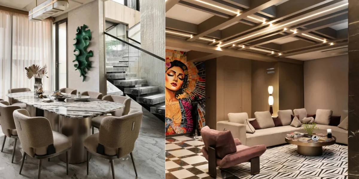
The living room is usually the strongest opportunity to establish the home’s primary colour identity.
Popular combinations include:
Warm ivory + taupe + walnut + brass
or
Greige + charcoal + cream + natural stone
Large furniture pieces can remain neutral while artwork, cushions, rugs, and occasional chairs introduce accent colours.
Dining Room
Dining areas can accommodate deeper and richer tones.
Consider:
- Olive and walnut
- Charcoal and brass
- Deep blue and cream
- Terracotta and beige
Dark colours can create an intimate atmosphere, particularly when paired with warm pendant lighting.
Kitchen
Luxury kitchens often benefit from restrained palettes.
Popular combinations include:
- Warm white + walnut
- Taupe + stone
- Greige + oak
- Charcoal + marble
- Cream + brushed brass
The colour of the cabinetry should also coordinate with flooring, backsplash materials, hardware, and adjacent living areas.
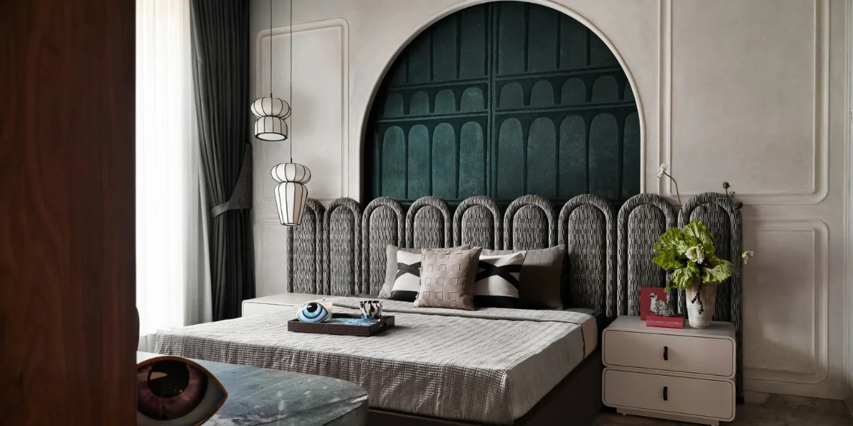
Master Bedroom
Bedrooms benefit from calming colour combinations.
Consider:
- Beige + cream + walnut
- Sage + ivory + natural wood
- Greige + taupe + bronze
- Dusty blue + warm white
Avoid excessive contrast if the objective is to create a restful atmosphere.
Bathrooms
Luxury bathrooms can use colour to create a spa-like environment.
Suitable palettes include:
- Ivory + beige stone
- White + warm grey
- Travertine + brown
- Charcoal + cream
- Sage + natural stone
Large-format stone surfaces can also create visual continuity with minimal colour variation.
Home Office
A home office can support deeper tones than a bedroom.
Consider:
- Walnut + charcoal
- Olive + brown
- Navy + cream
- Greige + black
These combinations can create a focused, sophisticated environment.
FAQs: Room-by-Room Colour Palette Ideas for Villa Apartments
1. What colour palette is best for a luxury villa apartment living room?
Warm ivory, beige, taupe, greige, walnut, and subtle brass accents work well for luxury living rooms. These colours create an elegant foundation while allowing furniture, artwork, and lighting to stand out.
2. Which colours are suitable for a villa apartment master bedroom?
Soft beige, cream, greige, sage green, dusty blue, and warm taupe are excellent choices for a master bedroom. They create a calm, comfortable atmosphere while maintaining a sophisticated luxury aesthetic.
3. What colours work best for luxury villa apartment kitchens?
Warm white, cream, taupe, greige, walnut, and charcoal are popular choices for luxury kitchens. The palette should coordinate with the cabinetry, countertops, backsplash, flooring, and hardware.
4. How can colour be used to make a villa apartment bathroom feel luxurious?
Neutral shades such as ivory, beige, warm grey, travertine, and soft brown can create a spa-inspired bathroom. Pairing these colours with stone surfaces, layered lighting, and refined fixtures adds depth and elegance.
5. Should different rooms in a villa apartment use different colours?
Yes. Each room can have its own colour identity while sharing complementary tones across the home. Repeating colours through furniture, fabrics, wood finishes, or accessories helps maintain a cohesive interior.
6. What colours are suitable for a luxury villa apartment home office?
Deep walnut, charcoal, olive, navy, greige, and warm cream can create a focused and sophisticated home office. Darker shades work particularly well when balanced with natural light and lighter furnishings.
How to Choose the Right Villa Apartment Colour Palette
Choosing colours should begin with the physical characteristics of the apartment rather than paint samples alone.
1Study Natural Light
Observe how sunlight enters each room throughout the day.
North-facing or naturally darker rooms may benefit from warmer shades, while brightly lit rooms can accommodate deeper or cooler colours.
2Consider the Flooring
Flooring occupies a significant visual area. Marble, wood, stone, or tiles should influence the colour selection.
For example, warm wooden floors usually pair naturally with beige, cream, olive, terracotta, and brown.
3Start With Permanent Materials
Before selecting wall paint, consider materials that are expensive or difficult to replace, including:
- Flooring
- Marble
- Kitchen cabinetry
- Wardrobes
- Built-in furniture
- Stone surfaces
The colour palette should complement these elements.
4Create a 60-30-10 Balance
A useful interior design guideline is:
- 60%: Dominant or base colour
- 30%: Secondary colour
- 10%: Accent colour
This is not a strict formula, but it provides a useful starting point for maintaining visual balance.
5Test Colours at Different Times
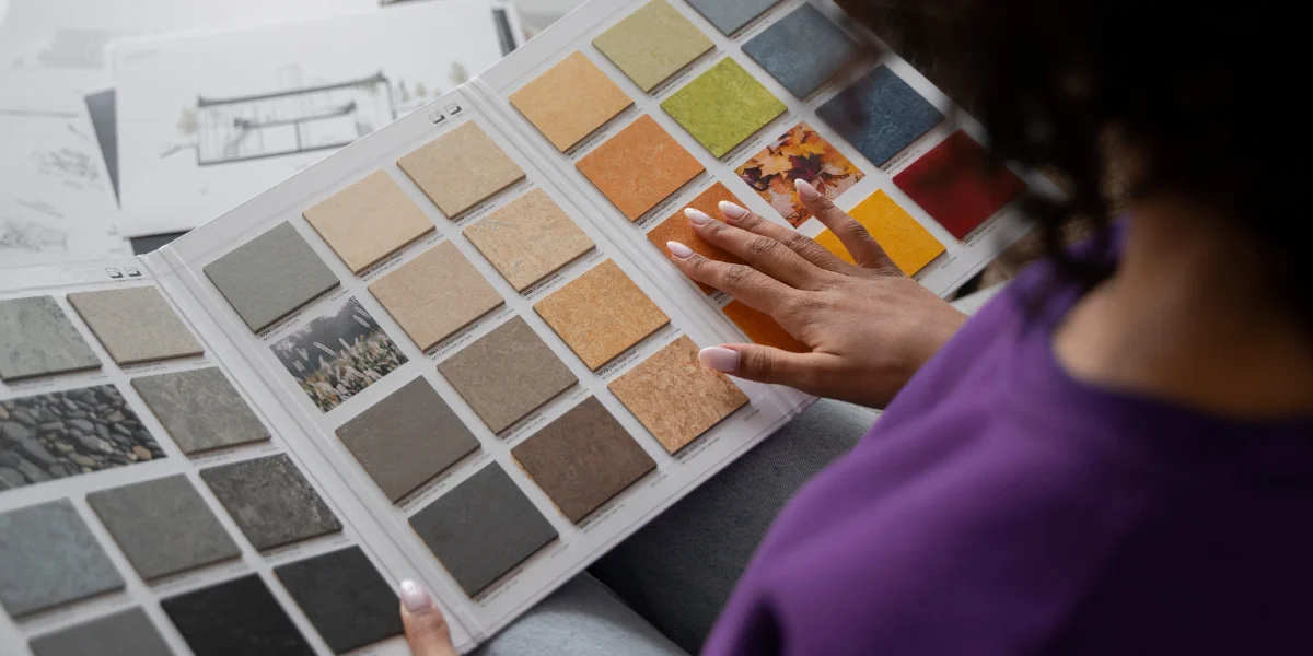
Always test paint and material samples in the actual room.
A colour can appear warmer under evening lighting and cooler under daylight. Large sample boards are generally more reliable than small paint chips.
FAQs: How to Choose the Right Villa Apartment Colour Palette
1. How do I choose a colour palette for my villa apartment?
Start by considering the natural light, flooring, architectural style, furniture, and permanent materials such as marble or wood. Choose a dominant base colour, a complementary secondary shade, and one or two accent colours to create a balanced look.
2. Should I choose wall colours before selecting furniture and materials?
Ideally, begin with permanent elements such as flooring, stone, cabinetry, and major furniture pieces. The wall colours can then be selected to complement these materials and create a cohesive villa apartment interior.
3. How many colours should a luxury villa apartment use?
A practical starting point is three main colour layers: a dominant colour, a secondary colour, and an accent shade. Different tones, textures, and natural materials can then add depth without making the interior feel visually cluttered.
Luxury Colour Combinations That Work Well Together
| Base Colour | Secondary Colour | Accent | Overall Effect |
|---|---|---|---|
| Warm Ivory | Taupe | Brass | Soft and elegant |
| Greige | Walnut | Charcoal | Contemporary |
| Cream | Olive | Bronze | Natural and refined |
| Beige | Terracotta | Brown | Warm and earthy |
| Soft Grey | Charcoal | Black | Modern and dramatic |
| Cream | Navy | Walnut | Classic and sophisticated |
| Sand | Sage | Natural Wood | Calm and organic |
| Ivory | Emerald | Brass | Rich and luxurious |
How Materials Influence Villa Apartment Colour Palettes
Colour does not exist independently from materials. In luxury interiors, the relationship between colour and material is often more important than the colour itself.
Marble
White and beige marble can support neutral palettes, while darker marble can introduce contrast.
Wood
Walnut creates a richer appearance, while light oak creates a softer and more contemporary look.
Metal
Brass and bronze can warm up neutral palettes, while blackened metal can create a more modern appearance.
Fabric
Velvet, linen, boucle, leather, and textured fabrics can make a simple colour palette feel considerably more luxurious.
Glass
Glass introduces transparency and allows stronger colours or darker materials to remain visually lighter.
Colour Trends for Luxury Villa Apartments
While timeless palettes are usually the safest long-term choice, several colour directions are becoming increasingly popular in contemporary luxury residential interiors.
Warm Minimalism
Instead of stark white, warm whites, beige, taupe, sand, and natural wood create a softer interpretation of minimalism.
Nature-Inspired Colours
Olive, sage, moss, clay, terracotta, and earthy browns bring organic character into contemporary homes.
Dark Accent Colours
Charcoal, deep green, navy, and chocolate brown can provide contrast in otherwise neutral interiors.
Tonal Interiors
Using several shades from the same colour family creates sophisticated depth without visual clutter.
Material-Led Colour
Rather than selecting paint first, designers increasingly build palettes around marble, timber, stone, metal, and textiles.
Common Colour Mistakes to Avoid in Villa Apartments
Using Too Many Colours
A luxury interior can quickly feel disconnected when every room introduces a completely different palette.
Choosing Colours Without Considering Lighting
Artificial lighting can significantly alter the appearance of colours.
Using Only One Shade
A single colour repeated across every surface can make a large villa apartment feel flat.
Ignoring Adjacent Rooms
Open-plan spaces require colour relationships between connected areas.
Overusing Accent Colours
Accent colours should enhance the design rather than compete with architectural features and materials.
Choosing Trends Over Timelessness
A fashionable colour may look attractive today but become visually dated. For major surfaces, timeless colours are generally a safer investment.
How to Create a Timeless Luxury Colour Palette
The most enduring villa apartment interiors usually combine neutral foundations with carefully selected accents.
A practical approach is to use:
1A timeless base colour for major walls and surfaces.
2Natural materials such as wood and stone for warmth.
3One secondary colour to create depth.
4One or two accent colours for personality.
5Metallic details for subtle luxury.
6Layered textures to prevent neutral interiors from looking flat.
This approach allows homeowners to update cushions, artwork, rugs, and accessories over time without redesigning the entire apartment.
FAQs – Sumessh Menon Associates–Focused
1. How does Sumessh Menon Associates approach colour palettes for luxury villa apartments?
Sumessh Menon Associates approaches colour as part of a complete interior design language, balancing architecture, materials, lighting, furniture, and spatial proportions to create sophisticated and cohesive villa apartment interiors.
2. What colour palettes work well for luxury villa apartments designed by Sumessh Menon Associates?
Refined neutral palettes, earthy tones, natural wood shades, deep accent colours, and subtle metallic finishes can work effectively in luxury villa apartments, particularly when layered with premium materials and textures.
3. Why is professional colour planning important for a luxury villa apartment?
Professional colour planning ensures that walls, flooring, furniture, lighting, artwork, and architectural elements work together. For a luxury villa apartment, this creates visual continuity while allowing individual spaces to retain their own character.
Final Thoughts
The best villa-apartment color palettes are not necessarily the boldest or most expensive-looking. They are the ones that create harmony between architecture, natural light, materials, furniture, and the people who live in the space.
A sophisticated villa apartment may use warm neutrals as its foundation, natural wood and stone for texture, deeper colours for contrast, and carefully selected accents for personality. The result is a home that feels luxurious without becoming excessive.
Whether the aesthetic is contemporary, minimalist, earthy, classic, or dramatic, a thoughtfully planned colour palette can transform a villa apartment into a cohesive and memorable luxury residence.
For homeowners planning a luxury villa apartment, the most effective approach is to select the palette alongside the materials, lighting, furniture, and architectural details, not as an afterthought.
Frequently Asked Questions About Villa Apartment Colour Palettes
What is the best colour palette for a luxury villa apartment?
Warm neutrals such as ivory, beige, taupe, greige, and natural wood are among the most versatile choices. They can be enhanced with accents such as olive, charcoal, navy, terracotta, brass, or bronze.
Which colours make a villa apartment look more luxurious?
Deep neutrals, warm whites, earthy greens, rich browns, muted blues, charcoal, and restrained metallic accents can create a luxurious appearance when balanced with quality materials and textures.
Are neutral colours suitable for luxury villa apartments?
Yes. Neutral colours are particularly effective because they provide a timeless backdrop for marble, wood, artwork, lighting, furniture, and decorative details.
Which colours make a villa apartment look bigger?
Light shades such as warm white, ivory, soft beige, pale greige, and light grey can help reflect light and create a more spacious visual impression.
How many colours should be used in a villa apartment?
A useful starting point is a three-colour hierarchy: one dominant colour, one secondary colour, and one accent colour. Additional shades can be introduced through materials and tonal variations.
Should every room in a villa apartment have the same colour palette?
Not necessarily. The rooms can have individual identities while sharing common colours, materials, or accent tones to maintain continuity throughout the home.
How do I choose colours for a villa apartment with marble flooring?
Start by identifying the undertones in the marble. Warm marble generally works well with beige, cream, taupe, walnut, terracotta, and brass, while cooler marble can work with grey, charcoal, muted blue, and black accents.
What colour palette works best for a modern villa apartment in India?
Warm neutrals, earthy greens, terracotta, walnut, beige, stone, and muted metallics work particularly well in Indian luxury homes because they complement natural materials, warm lighting, wood finishes, and handcrafted décor.